For the four letter word project I chose to do something fun. Being a graphics project I wanted to just do something more lighthearted than a complex piece, which is what i'm normally used to doing. I chose the word "smug" because it was a joke between me and my friends to call our friend smug. She doesnt mind the joke and thinks its funny, its an inside joke with some of the students that went on the spain trip this past April. For each letter I chose a different quality of our "smug friend" to portray. "S'" is in the shape of hair with flyaway hairs, because she always pulls them out what she puts her hair back. "M" is for medieval girl, this refurs to our trip to carcassone france when this friend dressed like she was from medieval times. "U" is in the shape of a neck pillow because she bought an overpriced pillow at the boston airport, and it became a running joke to make fun of how fancy it was supposed to be. "G" is for giggles because she laughs all the time and is always smiling, even at our jokes about her. I chose to use color because it would give it a fun vibe and I could accurtely depict parts of the jokes.
|
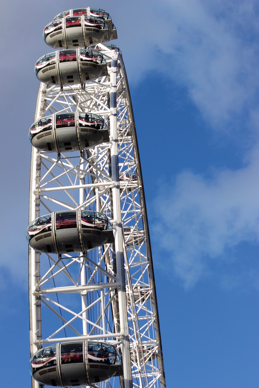
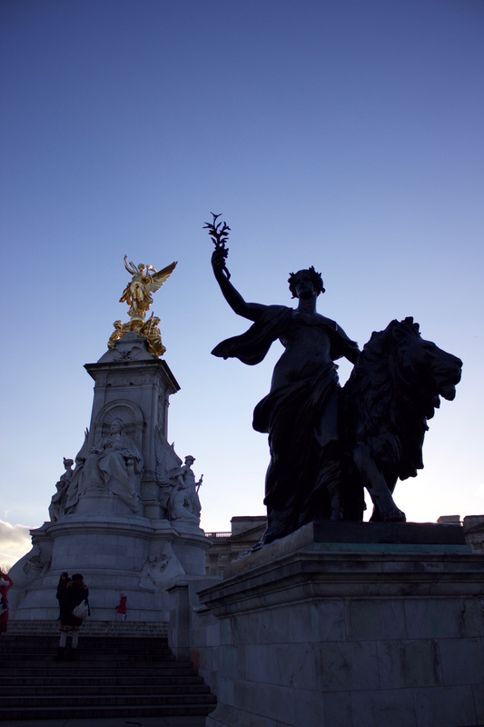
For my future self project I wanted to express my goal to travel. I visited London this past february to visit my brother and loved it. Normally you'd feel out of place in a foreign country but it just felt like home. The picture I chose to base my piece off of is a snap I took from Green Park, across from Buckingham palace. At the time I was fascinated that there were daffodils in bloom in such a cold place. I learned that these were the queens flowers and they were also illegal to pick. I though that the park itself was beautiful and the view of the palace through the trees was interesting. For my piece I choose scratch board. I just recently tried this medium for the first time and really enjoyed it. I thought that the metallic silver product from the scratching would give the plants an interesting quality of being shining on a dark surface. I chose not to scratch in the trees because I wanted a negative space on the piece, it made the other plants and palace stick out more as a result.
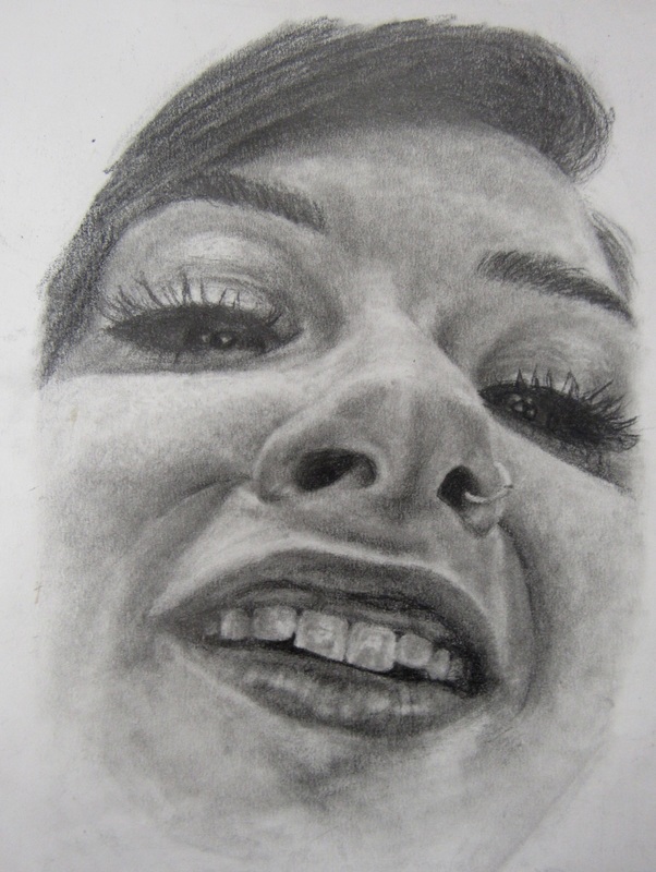
For the assignment on value I thought a glass object would be interesting to draw. This particular lamp has a very shiny surface and dark paint on top of white glass. I thought the contrast of the design and back ground would be ideal to show the difference between dark color and shadow/ Light color and highlight. The rounded surface of the lamp makes it easier to convey the source of light. 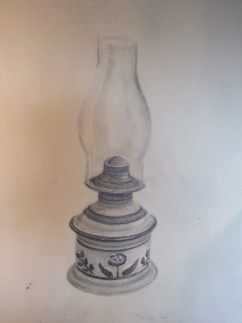 When I visited the Scholastic Art and Writing exhibit,I remember noticing a particular piece that had the illusion of seeing double. I thought it was a very cool and original idea and put it in the back of my mind to try some time, until I saw it in the inspiration examples for this assignment. So I tried to figure out exactly how the girl achieved this illusion, (never really found out), but I tried a different angle. In the original the girl was looking head on but I wanted to see if it would work with my head turned. I ultimately am not exactly pleased with how it turned out because I don't really think i did the illusion right, but it is something that I would try again.  I chose to combine Raven from the TV show Teen Titans and Eleven from the Netflix show Stranger Things. Both Eleven and Raven are outsiders within their friends, and both have telekinetic powers. While combining them I wanted to keep the character overall mysterious as thats Raven's signature trait, but incorporate Eleven's weird 1980's fashion. I also chose to change Eleven's hospital gown into a superhero-like suit like Raven's, and keep her head shaved because that was a very strange thing for a girl to have in the 1980's and was a defining characteristic. 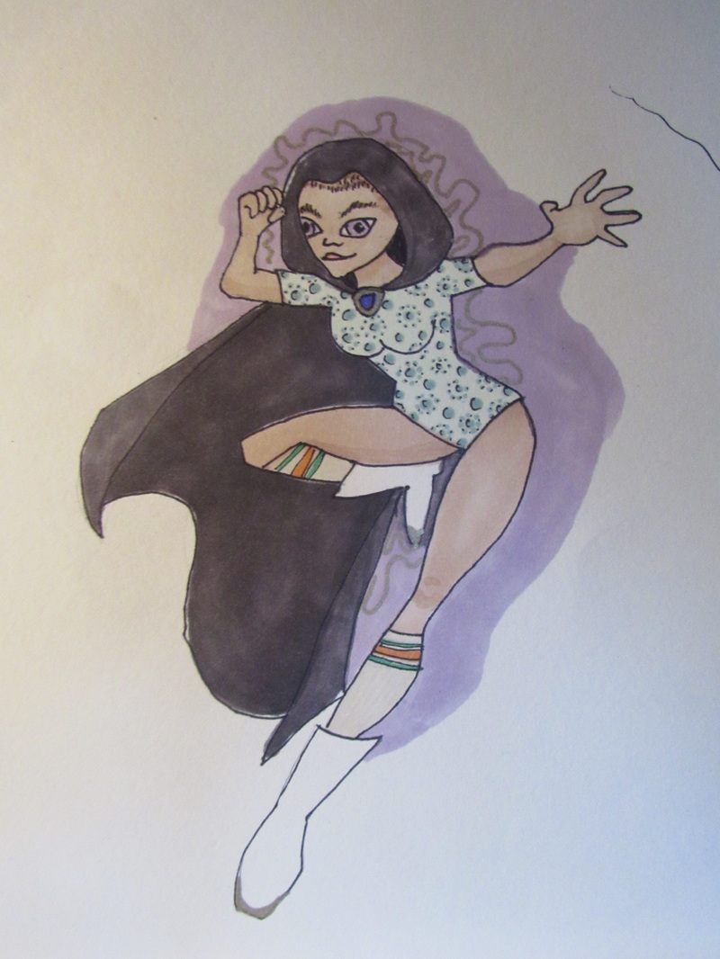 Claude monet is one of my favorite artists in terms of his use of color. He is known as an impressionist painter, creating landscapes with large loose brush strokes. Monet uses many soft muted colors to convey his lights and his darks while still giving a clear sense of value. His use of color gives his paintings a calm and serene tone. I would hang his paintings in my house because I think their color and unique brush patterns are beautiful.
After watching stakeout and color me Katie, I found that they were two very different people. In "stakeout" the artist, Deb, would place objects in public places and watch how people interacted wit it, usually baiting them with something to prompt them to interact. The stakeout felt more about gathering data and analyzing it artistically. Color me Katie was very much the opposite. She wanted to interact with people and make them smile by doing performance art or taking a picture with them. Katie also did a project called Brooklyn thought bubbles where she would create thought bubbles with an image inside and wait for the right person to walk by and snap a picture of it, this was also done with shadows. I think that seeing the way an artist observes says a lot about who they are as a person and how they want to express themselves.
CONCENTRATION
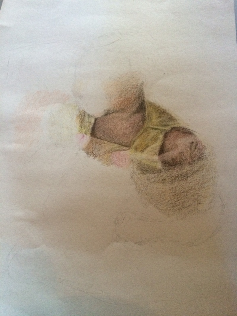
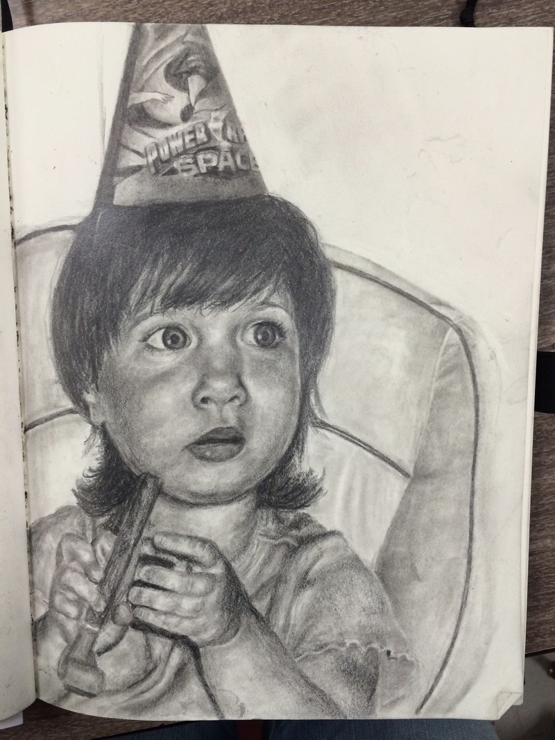
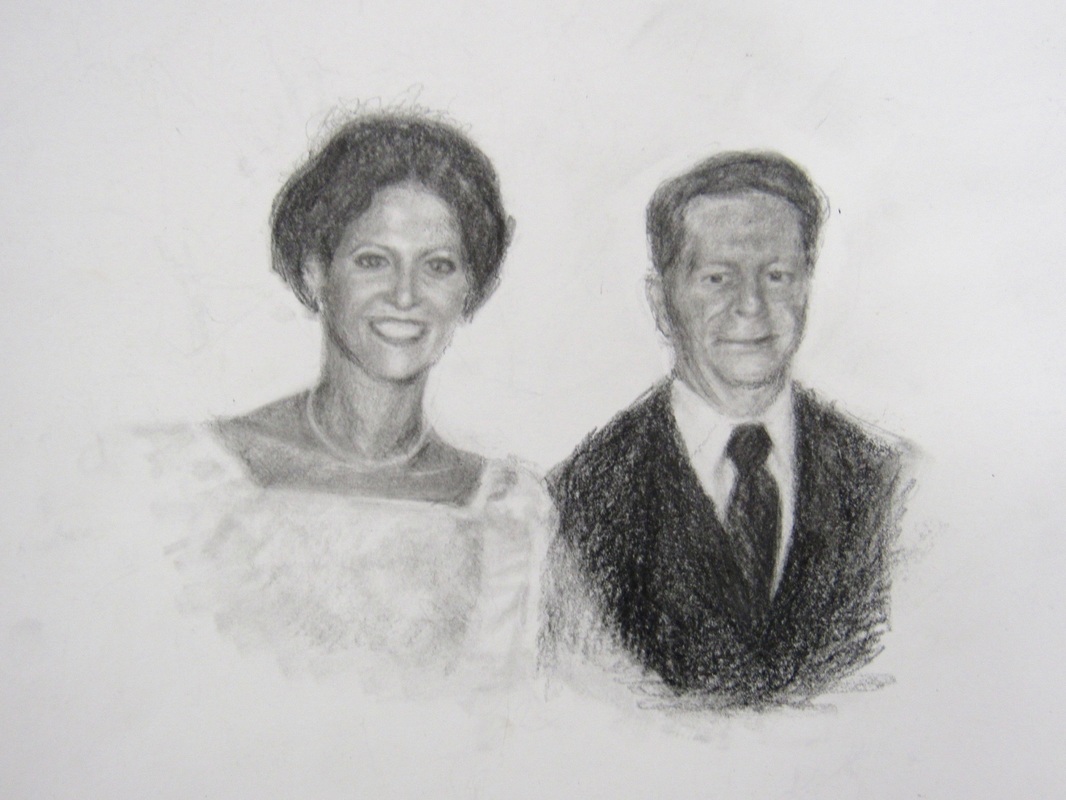
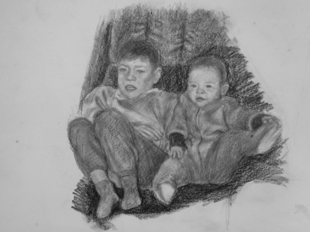
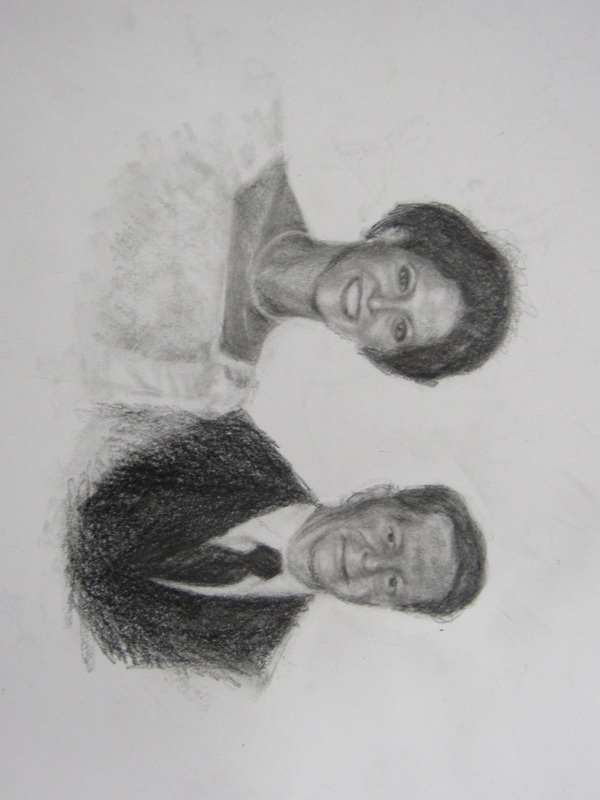
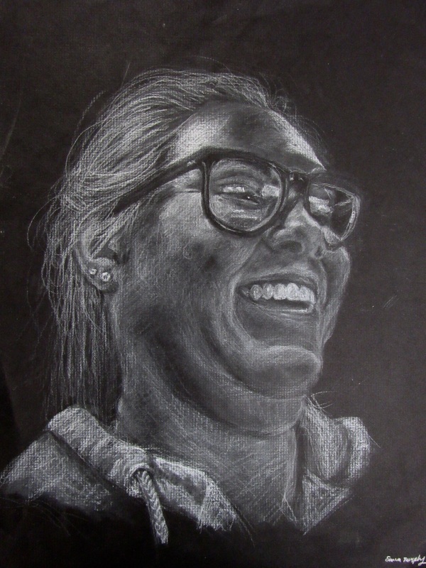
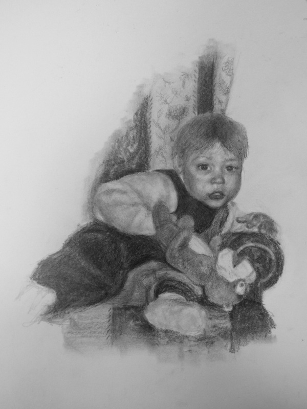
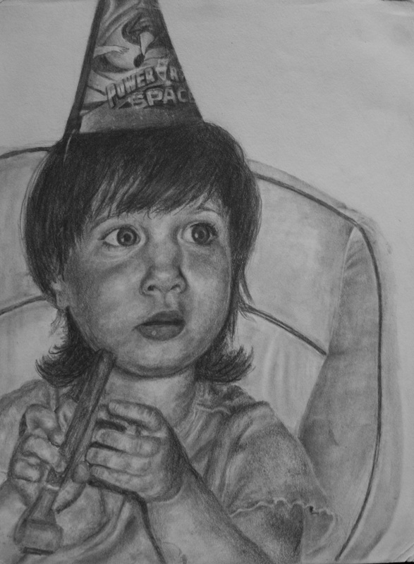
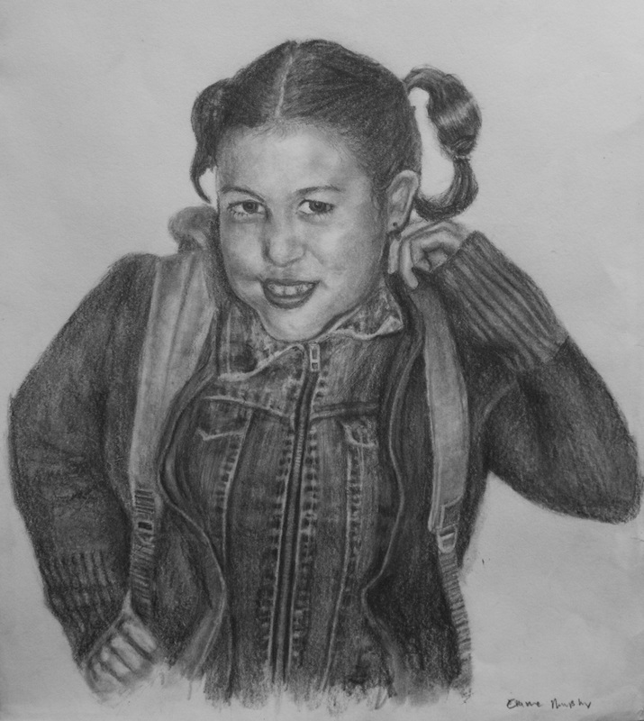
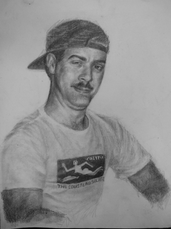
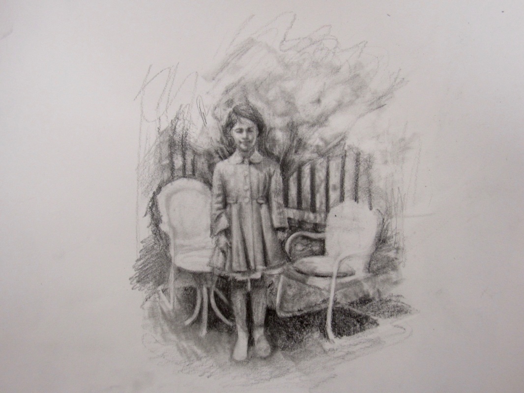
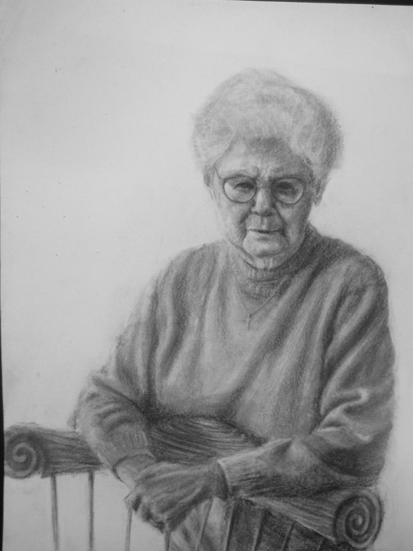
My concentration stemmed from an afternoon looking through old pictures of my family. Each picture I found touched different parts of my memories, and took me back to some of my earliest memories of being a child. Everything that happened to you as a child seemed so important and life changing and that’s what I wanted to convey in my concentration. I wanted to focus on the life changing moments within a family, such as births, deaths, and day to day realizations of parents and kids. EXPLORATION OF CONCENTRATION For my concentration I wanted to represent an important time in someone’s life in every piece. I wanted the focus to be on the subject or person and not on the memory as a whole so I chose to keep backgrounds minimal. I created a fading effect around many of pictures to represent the fading of a memory because of a major change, this can be seen in images 6,7,9, and 12. For example, image 9 is of me and my older brother as children; I wanted to represent how fast time passes as we are both nearing the end of our childhood. There are also two pieces containing two subjects; image 7 represents death, and image 9 represents birth. Image 7 depicts my mother and her father on her wedding day, before he died soon after. Image 9 also represents the last birth in my family and the start of a new life together. Lastly, comedy was another minor theme I wanted to include. I grew up in a very quirky family, and we always face hardships with the right amount of humor. Image 3 was taken before my uncle, the subject, had a stroke and suffered from nerve damage as a result. He was always a very energetic and happy person even through a very hard time in his life. I read the article on drawing from my imagination. I almost always draw from pictures i've taken and haven't really tried to just sit down and draw from my head. I enjoy spending weeks on my art and precisely re-creating from photos. This article made me realize I need to just draw sometimes; sit down and make something that isn't so detail intensive or time consuming. Im going to try doing simpler drawings that capture more of the mood of a subject, looking at form and color without copying it. |
AuthorWrite something about yourself. No need to be fancy, just an overview. Archives
August 2016
Categories |
 RSS Feed
